
HIPAA Compliance Solution - Page Redesign
Overview
A strategic UX/CRO and SEO overhaul of a HIPAA security software platform's Homepage and Enterprise Service pages. By restructuring hero sections, introducing scannable content accordions, and incorporating clear technical capability signals, the redesign successfully streamlined complex compliance messaging, reduced bounce rates, and delivered an immediate increase in qualified contact form leads.
Role
CRO Analyst, UX Designer, Implementation Manager
Tools
Google Analytics, Crazy Egg Heatmap & Session Recordings, Figma
The Process
Research
To sharpen the client’s market positioning and build a long-term SEO foundation, the discovery phase focused on analyzing high-impact touchpoints, specifically the Homepage and Enterprise Service page. Comprehensive competitive research and internal interviews with sales and customer care teams uncovered critical buyer personas, technical integration needs, and common prospect questions. Quantitative insights from Google Analytics were combined with heatmaps, session recordings, and a heuristic evaluation to diagnose high bounce rates and map drop-off points. Cross-functional collaboration with the SEO team supplied content hierarchy, keyword strategies, and messaging recommendations. These findings were presented to the client alongside a global site recommendation database and prioritized page-specific CRO proposals.
Design
Using the client's asset library, new responsive interface concepts were created in Figma to address early drop-offs and optimize user flow toward contact submissions. Because analytics showed heavy drop-off below the hero fold, hero sections were redesigned with benefit-driven copy and immediate CTAs to capture high-intent users before they exited to the main menu. To manage dense technical content without overwhelming visitors, interactive tabbed modules and collapsible accordions were introduced to encourage click engagement. High-value trust factors were woven into the layout, including company performance metrics, brand credentials, and technical integration capabilities paired with contextual CTAs. Technical feasibility was continually vetted with engineering during design buildout before handing off complete specs to the Account Manager.
Feedback & Iteration
Because the initial strategy directly addressed core buyer personas and technical requirements, client revision requests were minimal. A series of brief review sessions were conducted alongside the Account Manager and the client's internal engineering team to walk through page architecture, adjust terminology, and replace select visual assets to align with industry nuances. The design team executed all requested copy and visual modifications within a two-day turnaround window, securing swift executive sign-off for hand-off.
Hand Off
To support the client's internal development team, Figma assets and code packages were prepared with annotations detailing functional specs and CMS compatibility notes reviewed by an in-house developer. Following a confirmation review to ensure asset clarity, files were transferred alongside ongoing open-channel technical support during buildout. Within two weeks of post-launch deployment, the site demonstrated significant performance improvements across bounce rates, pages per session, average session duration, and contact form conversion rates.
Before & After
Homepage
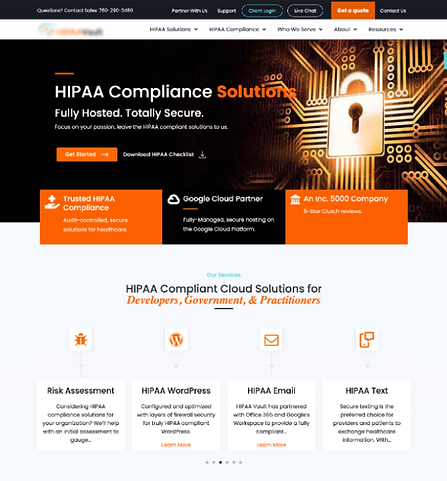

Incorporate Mega Menu Navigation
Redesigned desktop and mobile navigation with clear category hierarchies and dedicated promo spaces for resources like downloadable guides.
Hero Imagery & Branding Elements Updates
Updated hero visual with higher-quality, human-centric industry imagery incorporating brand color accents to increase emotional connection.
Add Immediate Trust Signals
Moved colorful certification, partnership, and compliance logos directly beneath the hero section to establish immediate credibility.
Make Service Cards Interactive
Focused the layout on three core services at once, replacing auto-scroll with manual arrow navigation, higher-contrast iconography, and dual CTAs for high- and low-intent visitors.
Better Target Audience Pathways
Added prominent quick-action CTAs driving traffic directly to dedicated "Who We Serve" industry landing pages.
Better Position 'About' Content & Key Metrics
Positioned "About Us" content alongside high-level performance statistics, using benefit-driven headers that reinforce total HIPAA compliance.


Alternate 'Our Process' Design
Reorganized the "Our Process" module into a vertical layout to guide users logically while increasing CTRs to contact and detail pages.
Enhanced Testimonials
Displayed multiple reviews simultaneously with prominent star ratings, deep-linked full testimonial archives, and expandable "Read More" accordions for long quotes.
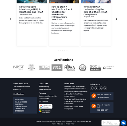
Streamline Blog Feed
Cleaned up the blog section by removing body excerpts to reduce visual clutter, showcasing only titles, authors, and publish dates.
Form Optimization
Redesigned the contact module with warm human imagery, clearer expectations of post-submission steps, and simplified fields (combining full name into one field and prioritizing email).
Make Footer More Functional
Reorganized footer links by primary resources, highlighted multi-channel contact options with operating hours, and shifted non-clickable security badges below legal terms.




Before & After
Enterprise Page
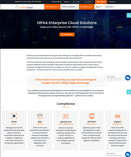

Unified Hero Layout
Standardized hero width to match the homepage, adding benefit-driven headlines, dual CTAs, and enterprise-grade facility imagery.
Included Targeted FAQ CTA
Integrated a "Jump to FAQs" anchor button as a primary secondary action to satisfy frequent user search behaviors.
Add Above-the-Fold Social Proof
Positioned enterprise case studies and client logos directly below the hero section with direct links to full success stories.
Add Inline Testimonial Touchpoints
Embedded real client testimonials in the second fold alongside expandable accordions highlighting core benefits like service simplification and support quality.
Utilize Tab Functionality
Replaced long text blocks with an interactive tab module featuring tailored CTAs, engaging visuals, and expanded copy pulled from top-performing articles.
Make Content More Digestible
Left-aligned service listings to align with reading patterns, hiding extra services and dense text behind "View All" and "Read More" expandable toggles.


Streamlined Integration Module
Condensed integration details into a side-by-side layout with standardized iconography that matches the core service cards.
Showcased Key Metrics
Brought performance statistics and high-converting company stats onto the page to communicate quality and build user confidence.
Include FAQs Low in Page Hierarchy
Placed a targeted list of enterprise-level FAQs lower in the page hierarchy due to user research indicating users frequently have questions / engage with FAQ content. This may help close the loop of questions and help drive users to contact.


