Dog Training Site - Page Redesign
Overview
This UX/CRO project focused on optimizing a dog training website's Homepage and Location Pages to increase scroll depth, improve user trust, and support local SEO initiatives. By replacing redundant, text-heavy layouts with strategic social proof, streamlined content blocks, and high-quality visuals, the project provided the client with fully approved Figma designs and developer-ready assets tailored for seamless in-house implementation.
Role
CRO Analyst, UX Designer
Tools
Google Analytics, Crazy Egg Heatmap & Session Recordings, Figma
The Process
Research
The client sought to revise the content and layout of their high-traffic Homepage and Location Pages to better showcase local dog trainers, service details, and SEO-optimized copy. To guide these improvements, I performed a comprehensive UX/CRO sitewide audit utilizing Google Analytics, heatmaps, user session recordings, heuristic walkthroughs of imagery and messaging, and a competitive analysis. These research findings directly informed page hierarchy and content recommendations delivered alongside the SEO and copywriting teams.
Design
To combat low engagement and poor scroll depth caused by heavy text and low-quality stock photography, I redesigned the targeted pages in Figma. The new layouts featured clearer hero sections, dynamic social proof, emotionally resonant headers, and upgraded pet-and-people imagery. Working within the constraints of the client’s existing website platform and plugins, I integrated new SEO-backed content blocks, including methodology details and value propositions, before confirming technical feasibility with an internal developer.
Feedback & Iteration
Following the client's review, both the SEO/copywriting team and I incorporated targeted adjustments to better align with local initiatives, trainer needs, and visual hierarchy preferences. I refined selected iconography, imagery, and copy placement to address the client's vision while preserving UX performance principles. A second version was delivered within a quick turnaround, receiving full approval after minor final tweaks.
Hand Off
Because the client planned to implement the designs in-house and repurpose elements sitewide, we structured and packaged the Figma design files specifically for their platform specifications. Our internal developer reviewed the handoff package to guarantee clarity for the client's technical team, and the final assets were delivered via the Account Manager with open availability for ongoing implementation support.
Homepage
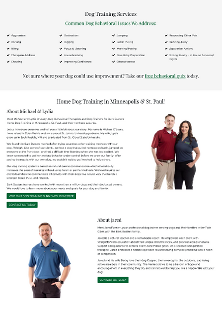
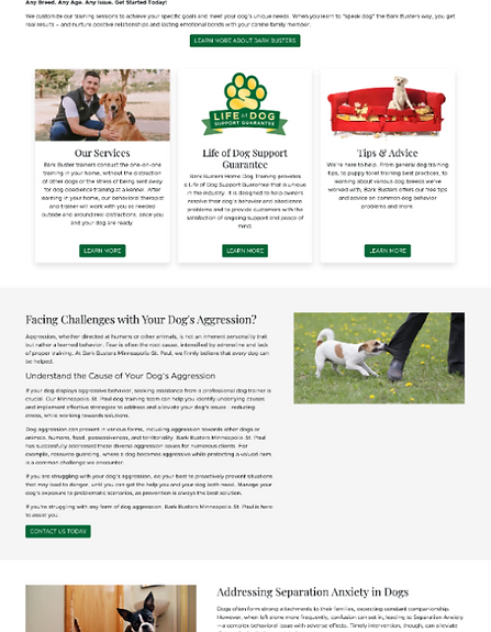
Before & After


Header & Navigation Adjustments
Separated the pre-header from the primary header, updating background colors for contrast on both the header and footer. Added a persistent "Find a Trainer" CTA in the primary navigation across devices and simplified contact options.
Clarify Hero Section
Enhanced trust by adding a dynamic review star-rating, high-quality trainer imagery, and a stronger UVP header. Highlighted the primary "Find Your Local Trainer" search container using brand green for improved visual impact and accessibility.
Changes to Service Listings
Moved performance metrics higher into the second fold and swapped in high-quality PNG imagery. Replaced repetitive primary buttons with tertiary links to reduce decision fatigue, and placed PR logos in an auto-scrolling carousel to build early authority.
Introduction of Value Propositions & About Info
Introduced key UVPs (e.g., lifetime support, in-home training) paired with custom icons and pet-focused visuals. Added a dedicated "About" section featuring brand design touches (paw prints) and a link to the full story.
Testimonials Revamp & Content Consolidation
Single-focused testimonial cards now display reviewer metadata, relevant imagery, and "read more" expandable text. Combined articles, news, and resources into a single tabbed carousel with enlarged arrow controls to reduce page length and prevent dead clicks.
Footer Area Redesign
Streamlined the pre-footer CTA with distinct visual styling, removed dense body text (such as career details), and organized footer navigation around quick links to core service categories.


Location Page
Before & After


Changes to Hero & On-Page Navigation
Clearer CTAs (e.g., "Get in Touch", dual-intent jump-links) pair with location review ratings and higher-quality imagery. A sticky secondary jump-link menu enables easy section navigation, supplemented by a sticky mobile "Contact a Trainer" CTA below the hero.
Adjustments to Information Architecture & Content
Key UVPs, core offerings, and common dog behaviors are unified into a single second-fold section alongside a minimized quiz CTA. Heavy body text is broken up into digestible blocks supported by high-quality stock photography, location-specific FAQs (addressing cost rationalization), and an "About" section covering methodology and guarantees.
Adding Social Proof & Engagement Techniques
PR logos display in an auto-scrolling carousel, and trainer bios use tabbed/carousel layouts with primary CTAs to manage cognitive load. Video libraries feature distinguished play icons and dynamic sizing.
Refine Some UX/UI Elements
Carousel arrow controls are enlarged across mobile and desktop to improve usability. A standardized "Stay up to date" section aligns location pages with the homepage layout.