Business Law Website - Page Redesign
Overview
A comprehensive UX/CRO redesign of a specialized law firm's WordPress website focused on optimizing the Homepage and Service Pages. By replacing complex navigation paths with focused messaging, primary CTAs, trust-building social proof, and a streamlined mobile flow, the project successfully enhanced user engagement and delivered a measurable surge in high-intent leads.
Role
CRO Analyst, UX Designer, Implementation Manager
Tools
Google Analytics, Crazy Egg Heatmap & Session Recordings, Figma, WordPress
The Process
Research
To improve lead generation and better showcase the firm’s specialized services, high-traffic pages—specifically the Homepage and Service Pages—were targeted for optimization. The strategy combined Google Analytics data, heatmaps, and session recordings to evaluate metrics like bounce rate, session duration, and user engagement paths. A heuristic evaluation assessed how messaging aligned with user psychology during key decision-making stages, while a competitive audit revealed industry design trends and positioning opportunities. Collaborating with the SEO and copywriting team, these data-driven findings, content recommendations, and keyword hierarchies were compiled into a presentation and an actionable UX/CRO improvement database for the client.
Design
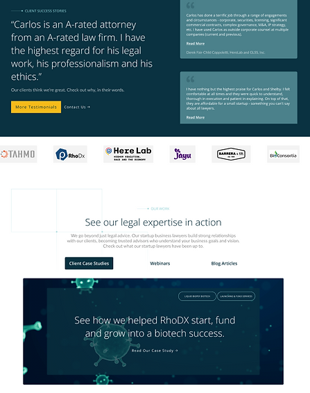
Using the client’s brand assets and team imagery, new page concepts were built in Figma to streamline user navigation. To solve homepage option paralysis, the hero section was redesigned into four targeted, rotational slides focused on core service lines, starting with high-demand Startup Services. The layout incorporated behavior-driven headlines, primary call-to-action buttons, performance metrics, and social proof elements like testimonials and team profiles to build trust. Additional engaging content sections were added for blog posts, webinars, and case studies, with a dedicated focus on simplifying the mobile experience for quick calls and form submissions. All designs were vetted with the in-house WordPress development team to guarantee technical feasibility before client review.
Feedback & Iteration
The client approved the overall direction, layout restructuring, and upgraded content hierarchy, providing minor revision requests for messaging and visual assets. While the UX and SEO teams addressed these feedback items—delivering updated designs and copy within a one-week turnaround—the development team duplicated the existing WordPress theme into a sandbox environment to begin foundational code work. Once the updated visual placements and content changes received final client sign-off, full development was authorized.
Hand Off
During buildout, continuous collaboration ensured design fidelity across desktop and mobile views. The site underwent a two-tier quality assurance process, evaluated first by the internal QA team and then reviewed against the Figma specs before final approval. After a guided walkthrough of the sandbox site with the client to demonstrate future maintenance workflows, a coordinated launch date was scheduled. Following deployment, three-month performance monitoring confirmed a sizeable increase in form-fill submissions and inbound phone calls from the optimized pages.
Before & After
Homepage

Updates to the Mobile Navigation
Increased contrast to meet accessibility standards and aligned subcategories with Desktop. Grouped 'Events', 'Client Love', 'About Us', and 'Resources' under primary parent categories. Promoted contact details and phone CTA directly into the mobile view.
Highlight Contact CTA
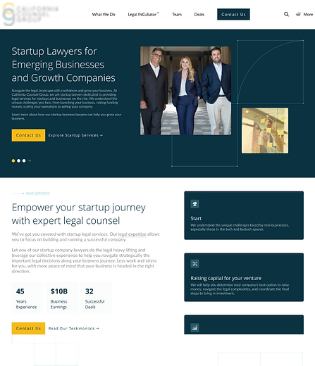
Highlighted 'Contact' in both desktop and mobile navigation bars for persistent, one-click access throughout the user journey.
Update Hero Section
Replaced static services with a multi-card slider featuring team imagery, a clearer value proposition, and primary/secondary CTAs to boost engagement.
Utilize Benefit-Driven Messaging
Reframed section headers using intent-driven, keyword-optimized language to address core user pain points and demonstrate expertise.
Use of UVPs & Metrics
Introduced performance metrics and icon-based UVPs to build immediate credibility. Moved services into an interactive carousel with clear CTAs to minimize unnecessary page toggling.
About Section Enhancements
Added prominent team imagery and detailed biographical content directly on the page to build trust earlier in the user journey and support SEO.


Redesign Testimonials & Social Proof
Redesigned testimonials with active CTAs and added an auto-rotating client logo carousel underneath to enhance authority.
Update Case Study Design for Engagement
Upgraded case studies with wider card layouts, rich video previews, and a multi-tab carousel featuring webinars and articles.
Alter Fooer Navigation
Modernized footer layout with quick-access site links, contact info, social channels, and dynamic next-step CTAs.

Before & After
Services Page


Top Fold & Messaging Updates
Redesigned the hero layout with benefit-driven headers to focus user attention on core value propositions.
Introduced primary and secondary CTAs to drive click-through rates directly to contact and service-growth pages.
Alternate 'Problem', 'Solution' Design
Consolidated 'Your Challenge' and 'Our Solution' into a single view to eliminate tab toggling and included a direct Contact CTA.
Addition of Team Bios
Added brief bios and photos for key client-facing staff (in a mobile carousel) to build trust early, support SEO, and boost overall conversion rates.


Reduced Heavy Text & Increased Engagement
Replaced heavy text blocks with an interactive tab system and accompanying CTAs to make content more skimmable and engaging.
Redesign Testimonials & Social Proof
Refreshed the testimonial section with actionable CTAs and added an auto-rotating carousel of client logos beneath it to reinforce social proof.
Update Case Study Design for Engagement
Upgraded case studies with wider card layouts, rich video previews, and a multi-tab carousel featuring webinars and articles.
Increase Interaction with Additional Service Listings
Converted previously non-clickable service listings into active touchpoints with desktop hover states and mobile click triggers to eliminate rage clicks and route users to the Contact page.